I've been taking some classes in making art for licensing. It's out of my comfort zone, but I am learning a lot. And it's been a good way to get me back making art after the loss of my mom & my job (on the same day!) ...and a debilitating knee injury! (both knees!)
These are online classes, so I don't have to venture out on my cane. The program is really amazing. Students are from all over the world, taught and developed by a remarkable woman, Lilla Rogers. She used to be a designer and is now a high powered agent, representing artists I really admire. She is a great teacher, very nurturing and kind, and so knowledgeable. The classes are packed with ACTUAL useful information! And the assignments are challenging, to say the least.
My greatest challenge, as you can see from the samples below, is finding a style to commit to.
In the past, as a greeting card artist and an animator, versatility was an asset. As a result, though, I
have no defined style of my own, really. I have been able to find it with my Fine Art, I am hoping these classes with help with my illustration.
If you are interested, here is the link to Lilla Rogers' site: Make Art That Sells
Here are some samples of the work I did in the first course:
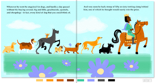
Children's Book Illustration
(My typical animation style)
I fell back on Flash vector art for this one. I suspect there's a chance this may be the style I end up with, but in the mean time I will try out other possible styles/techniques.

Art for Gifts
(This is also typical of my style: retro people. But "people" are not great for licensing, apparently) Here you can see my first pieces using my brand new Cintique, which I bought specifically for this course! I used one at EA. Not great for animating in Flash, but wonderful for freehand drawing!
Home Decor - Plates
Fell back on my Fine Arts style for this one - made with my ipad!
Flash again, tried something different, looks a bit harsh/forced to me.
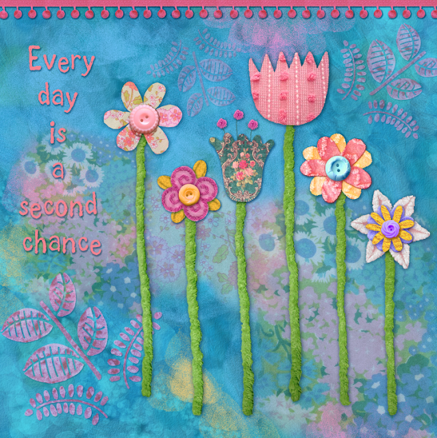
Wall Art
I think this one is dumb. They always want you to do flowers, I have never been that type of artist, so I came up with this clunky mess. I think I am getting more comfortable with flowers, though, which hopefully I will prove true in the work I do in the my current class. For this assignment they also wanted us to use found objects/textures. I have loved incorporating real life textures ever since my Blues Clues days. I used them in the backgrounds of my short film "The Old Flame" I was thrilled for the opportunity to use pompom trim again! I use it in my fine arts when I can!

New Class - Home Decor!
I've just started a new class that focuses on Home Decor. I f$%ked up the first assignment by leaving it til the last minute. It was to be a birds theme, and the products were to be metal. My sketches were cute but I really half assed the final piece. Needed more variety and patterns. I would like to say "I don't know what I was thinking", but the truth is I didn't have time to think because I was rushing. Asshole move. This week I am trying to get ahead of the deadline. Unlike graphic design, this is not the kind of thing I can do at the last minute. lol!
Sketches/Ideas
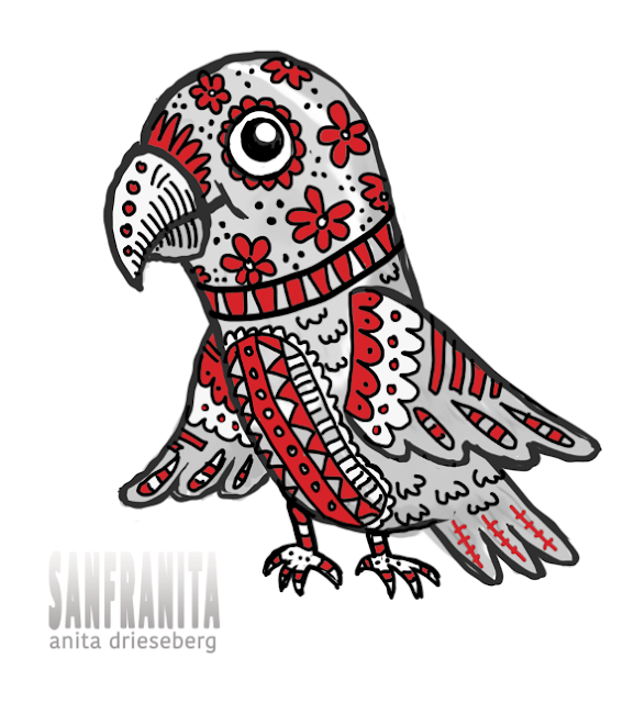
Tattooed Parrot!

Somehow I ended up with this.
The palette was chosen for us, btw. It's for a baby's room.
I guess it's ok, but not as professional as some of my fellow students.
I am particularly inspired by Asa Gilland and Tina Loffler. They have really defined styles and obviously know what they are doing. I have only been doing this for a couple of months, so I will try to be kind to myself. (That's hard for me!!!!)


No comments:
Post a Comment